

The Eras of Taylor Swift & The Impact Of the Experience Economy in Visual Storytelling
Introduction
Today, when a musician creates an album, it is no longer just a listening experience for their audience. Through visual branding and storytelling, the music created becomes a space the audience can fully immerse themselves in. A prime example of this is Taylor Swift's Eras Tour. The Eras Tour began in 2023 and concluded in 2024, with total attendance of 10.1 million people across 149 shows on 5 continents. After the massive success of The Eras Tour, it is important to reflect on the impact visual storytelling has on the music industry and its artists.
Taylor Swift has built a career around visual storytelling, emphasizing the creation of memorable visual worlds and identities for each album; thus, the creation and use of ‘Eras’ across her discography. By examining Swift’s eras and design tools like color, typography, symbolism, and nostalgia, Taylor has created not only a visual storytelling world but also a way for her audience to build emotional connections to her worlds through the concept of the Experience Economy. The Experience Economy is the idea of selling consumers an emotional connection along with a product to create a deeper, lasting impact.
Visual Branding of an Era
As stated above, Taylor Swift is best known for her distinct visual storytelling and branding for her discography. Rather than using a typical marketing cycle that lasts only as long as the album's trend and buzz, Taylor combines design tools like color, typography, album artwork, symbolism, visuals, emotional tone, photography, and even merchandise to create a memorable, long-lasting era. Consistent branding for each album lets her audience recognize each era immediately. “Taylor really has nailed the mastery of storytelling, in a way that the marketing and communications industry should envy. Her narratives are quite literally woven into her product” (De Cozar). When it was time to re-release Red, Taylor used the same design tools and visual identity to solidify further the album’s memorability in the audience’s mind. Taylor is also known for creating merchandise as part of each era’s identity, giving her audience a physical tie to the era. “Swift’s release of ‘All Too Well (10-Minute Version) (Taylor’s Version)’ includes the lyrics “‘f*ck the patriarchy’ keychain on the ground…” which was quickly followed by the release of a, you guessed it, ‘f*ck the patriarchy’ official Taylor Swift keychain for sale. Taylor Swift’s marketing team does an excellent job of creating an emotional connection to her merchandise, making it feel as though users have a piece of the story, rather than just an article of clothing or a knick-knack” (Noel). In another example from the Red era, the album used the color red as a central motif throughout the marketing cycle and the corresponding tour. Taylor’s artwork also plays a key role in developing the album's visual era.
Color Psychology in an Era
Red is not the only color that shapes an era in Taylor’s career. Taylor has used this tactic for every album and corresponding era. Taylor’s marketing team used color psychology as a visual storytelling tool to bridge the gap between the album and the audience, eliciting an emotional response and connection. “Color psychology is the theory that certain colors elicit a physical or emotional reaction and, in doing so, shape human behavior” (Clarke-Keane). By using various colors, Taylor has made eras recognizable by their correlating color alone. “When touched by personal experience, color becomes more than production but an important part of the identity of the branded” (Lucky). By breaking down each era’s color through color psychology, the audience can develop a specific emotional connection to each album. Taylor’s album Fearless was branded with gold/yellow, tying into the warmth, youth, and optimism of the album’s lyrics, which covered topics like first love, first heartbreak, and nostalgia for youth.
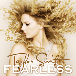
Taylor Swift (2008). Fearless[Album]. Big Machine. Image Source
As previously discussed, red was used for Taylor’s album with the same name to tie into themes of passion, intensity, and heartbreak. “Research shows that color words often trigger specific conceptual categories linked to those hues. Additionally, multidimensional color spaces align with biological and cultural perceptions of good-bad and dark-bright. Emotions mediate associations between color and stimuli, although these connections can be weak. Direct and indirect associations for various hues exist, with blues and greens signaling safety and tranquility, while reds convey aggression and warmth” (Lucky). Taylor’s 2017 album Reputation was branded in black, white, and dark grey tones to reflect her rebellion against the press, her personal reclamation of power, and anger.
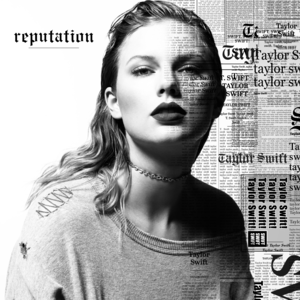
Taylor Swift (2017). Reputation[Album]. Big Machine. Image Source
In contrast, Taylor’s album after Reputation, Lover, uses pastels and light colors to signify renewed hope, love, and joy. “People who buy products or services are no exception when it comes to showing an affective colorful response to it. Colors, being an integral part of a product or service, greatly influence consumers’ perceptions of how good or bad that product or service is. In this regard, colors work in conjunction with shapes, letters, designs, and figures in communicating messages, marketing products and services, and enabling consumers or customers to store the information in their mind” (Lucky).
Designing & Building an Emotional World
As discussed, color plays an important role in how audiences connect and build an emotional attachment to each era. Other design elements like typography, photography, composition, and album artwork also play a similar role in helping people develop emotional connections to products. Taylor’s albums each have their own distinct typography used throughout their era and marketing cycle. “Fonts that provoke a psychological reaction can be used to make a brand feel more trustworthy, friendly, or aspirational, with designers often turning to emotional fonts to give brand identities a powerful psychological impact” (Fussell). One of the most distinct uses of typography in Taylor’s discography is her Reputation era. Reputation, as an album, became Taylor’s way of reclaiming her identity after years of scrutiny from the press and people online. In this era, Taylor also reclaimed the headlines used to beat her down and publicly scrutinize her, mimicking the newspaper and print fonts we associate with the press today. The font used in Reputation’s era signifies her reclamation of power and is bolder and more distinctive to catch the audience's attention. “From a visual communication perspective, typography ensures that the message being communicated to the reader comes across loud and clear. In considering the role of typography as it relates to visual communication, designers need to make sure their font choices are readable and easily legible—and that text is presented in a way that properly communicates the overarching sentiment and tone of the message” (RMCAD).
In contrast, eras like Speak Now and Lover used a script font as the main typography. The script font used for these two albums reflects each album's lightness. The script font also evokes positive emotions, like love, happiness, and hopefulness, through its swirling lines and shapes.
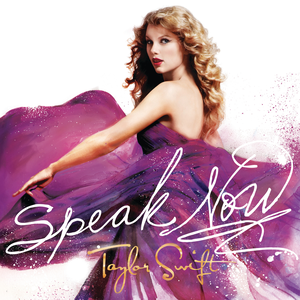
Taylor Swift (2010). Speak Now[Album]. Big Machine. Image source
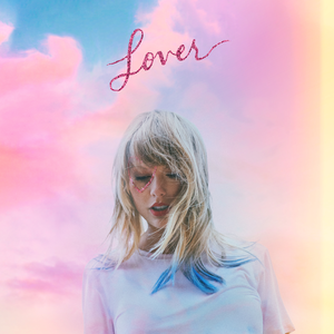
Taylor Swift (2019). Lover [Album]. Republic Records. Image Source
The typography, photography, and composition of the albums play a key role in bridging the work and the audience emotionally. In composition and photography, Taylor’s albums Folklore, Midnights, and The Tortured Poets Department use design tools like lighting, framing, negative space, and location to build an emotional response from the audience.
In Folklore, the album artwork is a simple grayscale image of Taylor in the distance, in an isolated, woodsy area. Released in 2020 during the COVID-19 pandemic, the album explored nostalgia, memory, and escapism that tied into what her audience was going through.

Taylor Swift (2020). Folklore [Album]. Republic Records. Image Source
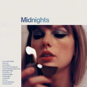
Taylor Swift (2020). Midnights [Album]. Republic Records. Image Source
Following Folklore, Taylor released and created the Midnights era. Midnights drew on the sleepless nights Taylor has experienced since entering the music industry, as well as the songs she crafted during that time that had not yet been fully developed or heard by her audience. Midnights' album cover used negative space and a simple composition, featuring only an image of Taylor and light, simple typography.

Taylor Swift (2020). The Tortured Poets Department: The Anthology[Album]. Republic Records. Image Source
In The Tortured Poets Department, the album artwork uses framing and negative space, with a simple black-and-white image of Taylor in the foreground. All three album covers are visually simple, with clear messaging through their lyrics. Still, they strongly shape the audience's emotional connection to each album, from the isolation of Folklore to the discontent of Midnights and the personal struggle of The Tortured Poets Department.
Nostalgia and Memory
By combining the design tools Taylor uses to build an era, fans can form an emotional attachment to each one. As a designer of a visual story, Taylor uses color psychology, typography, symbolism, photography, and composition to create a product. Similarly, she can use Plutchik’s Wheel of Emotions to build emotional connections between her audience and her album, or “product.” “The wheel can be used by designers to examine the complexities of emotion and to act as a “colour palette” for emotional design – with the idea being that blending different emotions will create different levels of emotional response and intensities of that response” (IxDF). For example, her album Fearless reflects warmth, youth, and optimism through its visual design, pairing these visuals with lyrics about first love, growing up, and first heartbreak. This visual world can help the audience connect their own nostalgia for childhood and youth with the album. This lets the album serve as a touchstone for a particular moment in their own life. “Sometimes, we avoid imagery that makes us sad or uncomfortable. However, disrupting the norm with something that overwhelms the senses can trigger someone to act. Your audience will be more ready to engage when you invite them into your reality with powerful, emotional, and visual storytelling” ( Montalto). Folklore reflects a visual world of isolation and escapism through its visual storytelling. By using the timely release and its visual story, it allows the audience to build an emotional connection to the world during a global pandemic, which was a time of stress, sadness, and overwhelm, where people were looking for connection and a chance to escape the otherwise scary world they had found themselves in.
From Audience Member to Active Participant
As Taylor’s visual storytelling and her discography deepen, the audience gets a chance to become active participants in each era. Through the development and execution of a particular era's visual story, the audience can build an emotional touchstone with the album, whether through escapism, love, heartbreak, or anger. The audience then becomes an active participant in the era by recreating their own personal attachments to it. This is particularly evident when the audience member goes to an Eras Tour show and recreates iconic images and motifs from the era. One popular example is recreating Taylor’s tour outfits from a particular or favorite era of her music, ranging from her gold shimmering dress from her debut tour to a full recreation of a snake bodysuit representing the Reputation tour. Audience members can also become active participants through the connections they make online and in person with fellow participants, creating a community of people with like-minded memories and attachments to the art and the artist. This bridges the gap and provides an outlet for emotional connection to the music, allowing the audience to become more than consumers and a metric for the marketing team to hit, but active participants who can physically step into the era’s visual storytelling.
From an Era to an Experience
The Eras Tour is the pinnacle of the combination of Taylor’s visual storytelling success for each era and the emotional attachment formed by her audience, or in this case, active participants. The Eras Tour has taken Taylor’s entire career, where she has spent every era meticulously planning and designing to have a particular emotional connection with her audience, and brought it all together for a fully immersive and cohesive experience for her audience. It also emphasizes the importance of connecting emotionally with the music.
Throughout the show, each era has distinct characteristics and avoids blending them together. This is done through another set of Eras Tour-specific visual storytelling. Each visit to an era, from Fearless to The Tortured Poets Department, features costumes, stage design, choreography, props, and color specific to that era and tied back to its original tours and themes.
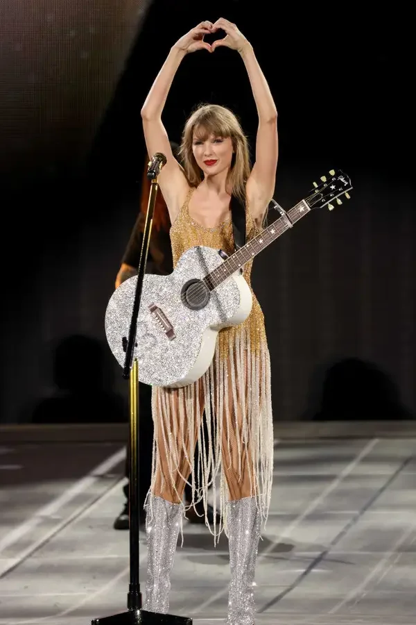
“Many products are deliberately designed to evoke emotions within the user. Designers have several ways of doing this. Most designers have a good intuitive feel for how users are likely to react to a product, as well as a good feeling for the importance of the three aspects of design that can induce affect in users: appearance (Visceral), behavior and function (Behavioral), and image and brand considerations (Reflective)” (Norman & Ortony). This allows the audience to actively reconnect with an emotional touchstone from their life. “One way to think about experiences is across two dimensions. The first corresponds to customer participation. At one end of the spectrum lies passive participation, in which customers don't affect the performance at all. Such participants include symphony-goers, for example, who experience the event as observers or listeners. At the other end of the spectrum lies active participation, in which customers play key roles in creating the performance or event that yields the experience” (Pine & Gilmore).
As the audience transitions to active participants at the Eras Tour, they may not be actively thinking about the present moment: watching an artist they love perform, but instead thinking about their emotional connection to the particular era.
Replaying on Social Media
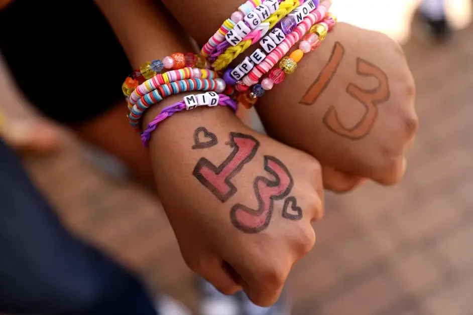
Audience participation in the Eras Tour builds on the community Taylor Swift has carefully cultivated throughout her career, starting on the first night of the tour, whether fans are there in person or not. “Swift has not only captured hearts but also wallets, solidifying her position as one of the most influential figures in contemporary popular culture. Her brand extends far beyond music, permeating fashion, philanthropy, and even political discourse, underscoring the economic significance of her authentic persona (Smialek, 2021; Driessen, 2020; Avdeeff, 2021)” (Khanal). After waiting in an online forum to buy tour tickets, the experience is only just beginning. “Consumers increasingly seek experiences not merely for what they are but for how they make them feel, how they reflect who they are, and how they connect them to others” (Goodman, Galak & Diehl). Next steps often included choosing a particular era and building your own personal experience completely around it. Building out an outfit from that era, creating a poster with a significant saying or image from the era of the audience member’s choice, and making friendship bracelets to act as second tickets and as physical proof of the experience and a tie back to Taylor’s earliest days as an artist to later trade at the event with people you have never met but feel a sense of community and understanding with.
The experience doesn't end when the concert does; it lives on as people spend the following days on social media sharing photos and videos from the event. “Social media has transformed how artists connect with their audience. Taylor Swift has effectively leveraged these platforms to communicate with her fans and build her brand. She maintains an active, genuine presence on Instagram and X, allowing fans to feel more involved in her journey. This has led to a strong and thriving community, redefining the traditional relationship between artists and their fans” (DAN). Throughout the Eras Tour, not just one particular show, the music becomes a space where audiences can fully immerse themselves physically and digitally and reminisce about experiences in their own lives that connect to Taylor and her music.
Conclusion
Taylor Swift has built a career and musical lineage around visual storytelling, emphasizing the creation of memorable visual worlds and identities for each album, culminating in the highly successful Eras Tour. Through the above examination of Swift’s eras and design tools like color, typography, symbolism, and nostalgia, Taylor has created not only a visual storytelling world but also a way for her audience to build emotional connections to her worlds by buying into the Taylor Swift-owned and operated Experience Economy.
Bibliography:
Aprile, M. (2024, December 2). The Personal Branding Journey of Taylor Swift. Digital Agency Network. https://digitalagencynetwork.com/the-personal-branding-journey-of-taylor-swift/
Clark-Keane, C. (2025, April 28). 8 ways to use color psychology in marketing (with examples). Module 3. WordStream. https://www.wordstream.com/blog/ws/2022/07/12/color-psychology-marketing
Cozar, K. D. (2024, June 24). Why Taylor Swift is a marketing genius – and four key lessons brands can learn. CCGroup. https://ccgrouppr.com/blog/why-taylor-swift-is-a-marketing-genius-and-four-key-lessons-brands-can-learn/
Designers and users: Two perspectives on emotion and design1 Donald A. Norman. (n.d.-a). Module 3 https://projectsfinal.interactionivrea.org/2004-2005/SYMPOSIUM%202005/communication%20material/DESIGNERS%20AND%20USERS_Norman.pdf
Eddy. (2026, March 30). The impact of typography in Effective Graphic Design. RMCAD. https://www.rmcad.edu/blog/the-impact-of-typography-in-effective-graphic-design/
Experiencing consumption: The social nature and physicalization of the ephemeral | Journal of the Association for Consumer Research: Vol 10, no 4. (n.d.-b). https://www.journals.uchicago.edu/doi/full/10.1086/738040
II, B. J. P., & Gilmore, J. H. (1998, July 1). Welcome to the experience economy. Harvard Business Review. Module 3. https://hbr.org/1998/07/welcome-to-the-experience-economy
IxDF - Interaction Design Foundation. (2026, March 11). Putting some emotion into your design – Plutchik’s wheel of emotions. IxDF. Module 3
Khanal, K. (2024). Taylor Swift’s branding strategy. In P. Rodrigues, A. P. Borges, E. Vieira, & V. Tavares (Eds.), Compelling Storytelling Narratives for Sustainable Branding (pp. 230–243). essay, IGI Global Scientific Publishing.
Lupton, E. (2021). Design is storytelling. Cooper Hewitt, Smithsonian Design Museum. Module 3
Montalto, M. (2024, January 25). The four principles of visual storytelling. amplifi. Module 1
https://amplifinp.com/blog/4-principles-visual-storytelling/
Newport International Journal. (n.d.). https://nijournals.org/the-psychology-of-color-in-branding-and-marketing/
Noel, E. (2025, October 18). Era to era: 6 lessons you can learn from Taylor Swift’s marketing. Informa TechTarget. https://www.informatechtarget.com/blog/era-to-era-6-lessons-you-can-learn-from-taylor-swifts-marketing/
The psychology of fonts: How to choose fonts that evoke emotion. (n.d.-c). Module 3
https://elements.envato.com/learn/the-psychology-of-fonts-fonts-that-evoke-emotion
What is emotional design? - updated 2026. IxDF. (n.d.). https://ixdf.org/literature/topics/emotional-design
