

Branding that Inpsires me
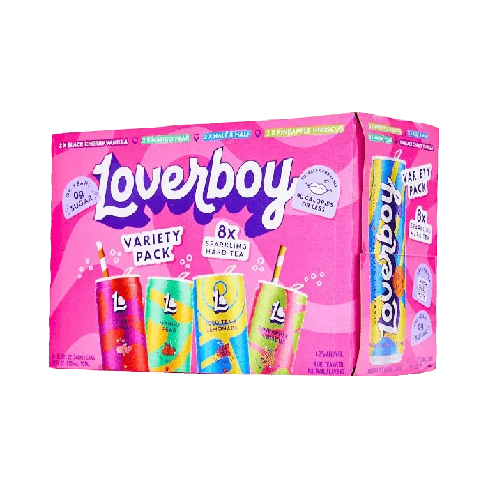
Loverboy as a brand inspired me to have more fun with design. The bright colors catch attention, and the swirling font is a fun choice to pair with them. The actual flavors of the product are unique to their competitors on the market, and their color stories are just as unique. I also think this particular branding style is a fun disruptor not only in the alcohol industry but in general, as most designs tend to be minimal or clean to align with today's trends. Loverboy contains a maximalist, fun aesthetic to pair with the good time marketing language used in their copy on their site.
Talk about a iconic branding…Victoria’s Secret has rarely changed their font and branding over the years but it works for products they produce. It is a classic, reliable brand with a design that pairs with it while maintaining an air of luxury through its branding and logo.
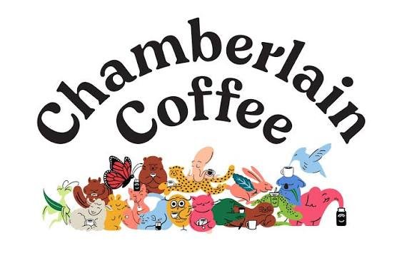
Chamberlain Coffee came out in 2019, and to me, this is a brand that almost acts like a time capsule through its branding. Due to its launch before the COVID Pandemic, the bright colors and curved font serve as a marker of a time when many companies changed their branding, and new companies adopted a minimalist design approach to pair with the hectic times in the world. As we have returned to a new normal, the company hasn’t changed its branding, as I feel it served as a trend setter for companies launching now or rebranding post-pandemic.
Nike inspires me because of its simple logo motif. I’d dare to say that when most think of a sports brand logo, they think of Nike’s simple yet memorable logo. The branding also emphasizes the importance of your logo and slogan being able to play off each other. Nike’s slogan “Just do it” is as simple yet memorable as their logo.
